
MMMLY COOKIES GRAPHIC IDENTITY
MMMLY COOKIES GRAPHIC IDENTITY
MMMLY COOKIES GRAPHIC IDENTITY
Mmmly brand is built on the belief that healthy eating should never feel restrictive or boring. It offers delicious, keto-friendly cookies made with wholesome ingredients, low in carbs and sugar, yet rich in flavor and satisfaction. Designed for those who want to maintain a balanced lifestyle without giving up on indulgence, the brand speaks to modern consumers who value both wellness and enjoyment. Its tone is friendly, inclusive, and optimistic, encouraging people to treat themselves without guilt.
Mmmly brand is built on the belief that healthy eating should never feel restrictive or boring. It offers delicious, keto-friendly cookies made with wholesome ingredients, low in carbs and sugar, yet rich in flavor and satisfaction. Designed for those who want to maintain a balanced lifestyle without giving up on indulgence, the brand speaks to modern consumers who value both wellness and enjoyment. Its tone is friendly, inclusive, and optimistic, encouraging people to treat themselves without guilt.
Mmmly brand is built on the belief that healthy eating should never feel restrictive or boring. It offers delicious, keto-friendly cookies made with wholesome ingredients, low in carbs and sugar, yet rich in flavor and satisfaction. Designed for those who want to maintain a balanced lifestyle without giving up on indulgence, the brand speaks to modern consumers who value both wellness and enjoyment. Its tone is friendly, inclusive, and optimistic, encouraging people to treat themselves without guilt.

For this project, a branding core was developed for the base flavor packaging designs, establishing a strong visual foundation for the product line. The brand was brought to life with whimsical imagery that extended beyond the packaging, creating a cohesive and playful look across the website, store displays, and social media content. This imaginative visual style helped reinforce the brand’s personality and message at every customer touchpoint.
For this project, a branding core was developed for the base flavor packaging designs, establishing a strong visual foundation for the product line. The brand was brought to life with whimsical imagery that extended beyond the packaging, creating a cohesive and playful look across the website, store displays, and social media content. This imaginative visual style helped reinforce the brand’s personality and message at every customer touchpoint.
For this project, a branding core was developed for the base flavor packaging designs, establishing a strong visual foundation for the product line. The brand was brought to life with whimsical imagery that extended beyond the packaging, creating a cohesive and playful look across the website, store displays, and social media content. This imaginative visual style helped reinforce the brand’s personality and message at every customer touchpoint.

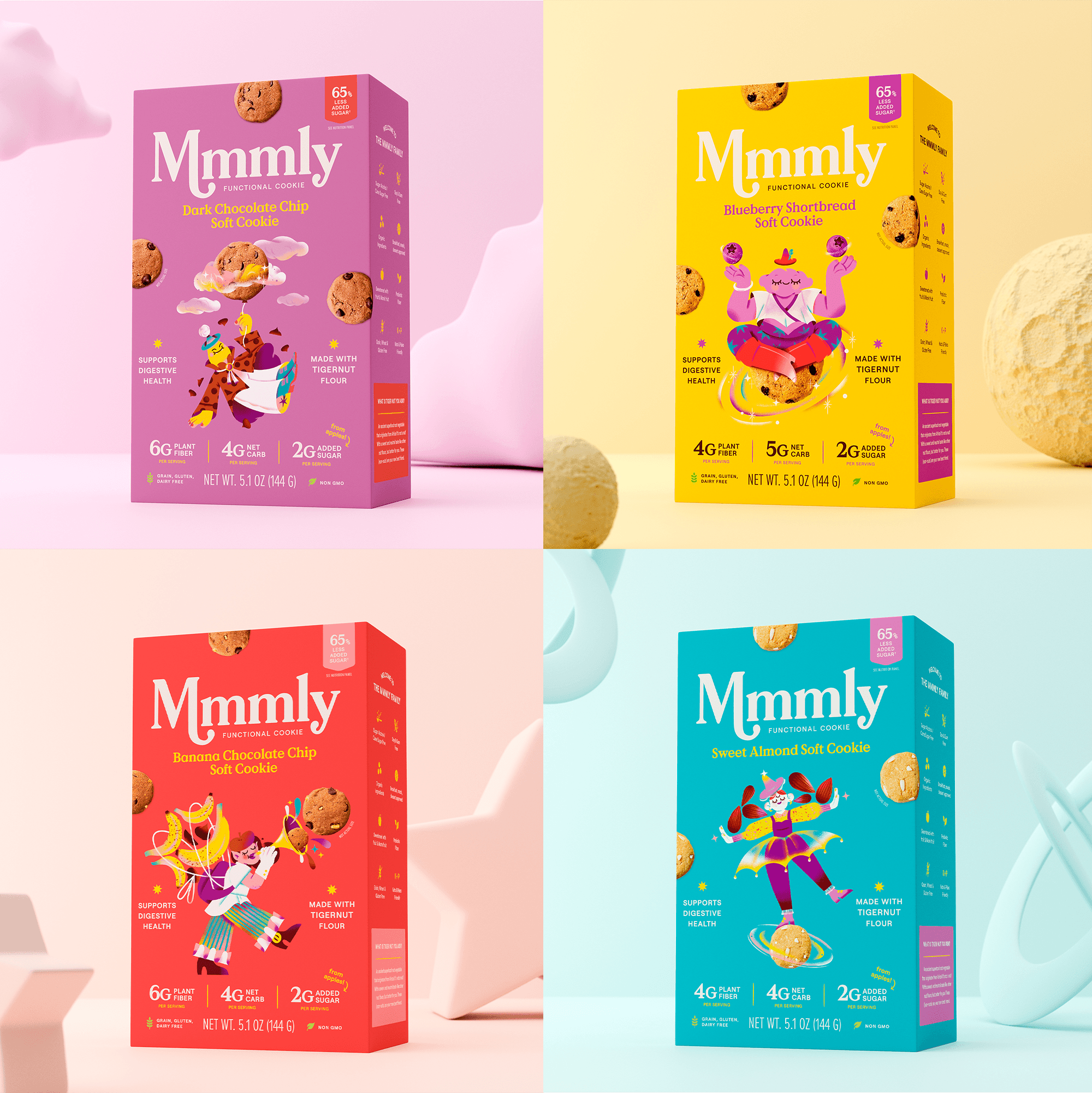

A lot of supporting imagery was created to expand the Mmmly universe and add more storytelling to social media and other oulets.
A lot of supporting imagery was created to expand the Mmmly universe and add more storytelling to social media and other oulets.
A lot of supporting imagery was created to expand the Mmmly universe and add more storytelling to social media and other oulets.


