
UNIMAGINABLE FOODS: BRANDING & PACKAGING
UNIMAGINABLE FOODS: BRANDING & PACKAGING
UNIMAGINABLE FOODS: BRANDING & PACKAGING
Unimaginable Foods is on a mission to future-proof everyone’s favorite snacks and build resilience in the food system. They make traditional, staple snacks more sustainable and nutritious by replacing soil-degrading mono-crops with climate-resilient plants, like pulses. Their core customers are health enthusiasts.
Unimaginable Foods is on a mission to future-proof everyone’s favorite snacks and build resilience in the food system. They make traditional, staple snacks more sustainable and nutritious by replacing soil-degrading mono-crops with climate-resilient plants, like pulses. Their core customers are health enthusiasts.
Unimaginable Foods is on a mission to future-proof everyone’s favorite snacks and build resilience in the food system. They make traditional, staple snacks more sustainable and nutritious by replacing soil-degrading mono-crops with climate-resilient plants, like pulses. Their core customers are health enthusiasts.
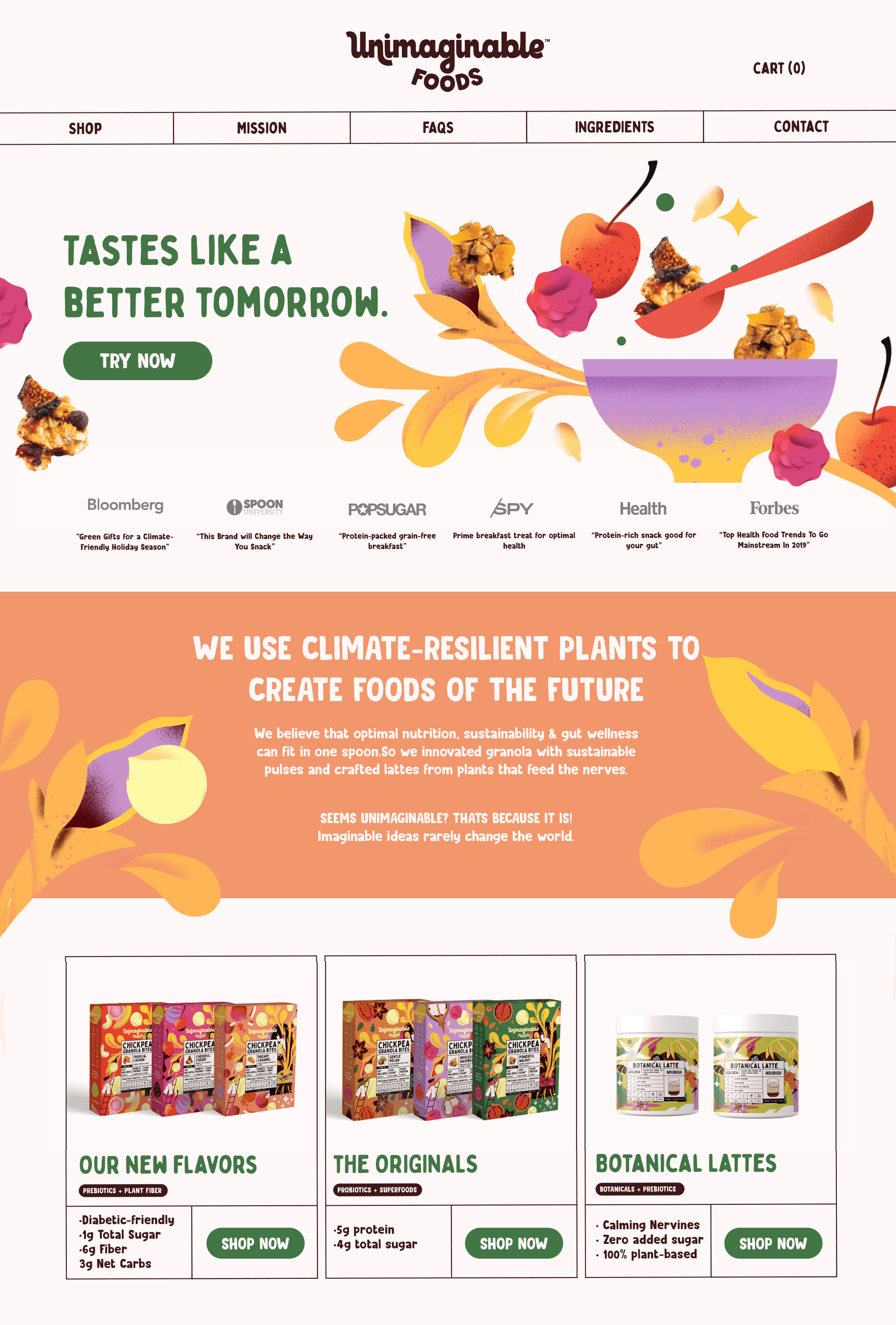
Juicy ingredient illustrations help Unimaginable Foods stand out and attract attention. Bright colors and playful details make healthy ingredients look fun, fresh, and exciting. A hint of whimsy adds a sense of wonder, turning everyday snacks into something special.
Juicy ingredient illustrations help Unimaginable Foods stand out and attract attention. Bright colors and playful details make healthy ingredients look fun, fresh, and exciting. A hint of whimsy adds a sense of wonder, turning everyday snacks into something special.
Juicy ingredient illustrations help Unimaginable Foods stand out and attract attention. Bright colors and playful details make healthy ingredients look fun, fresh, and exciting. A hint of whimsy adds a sense of wonder, turning everyday snacks into something special.


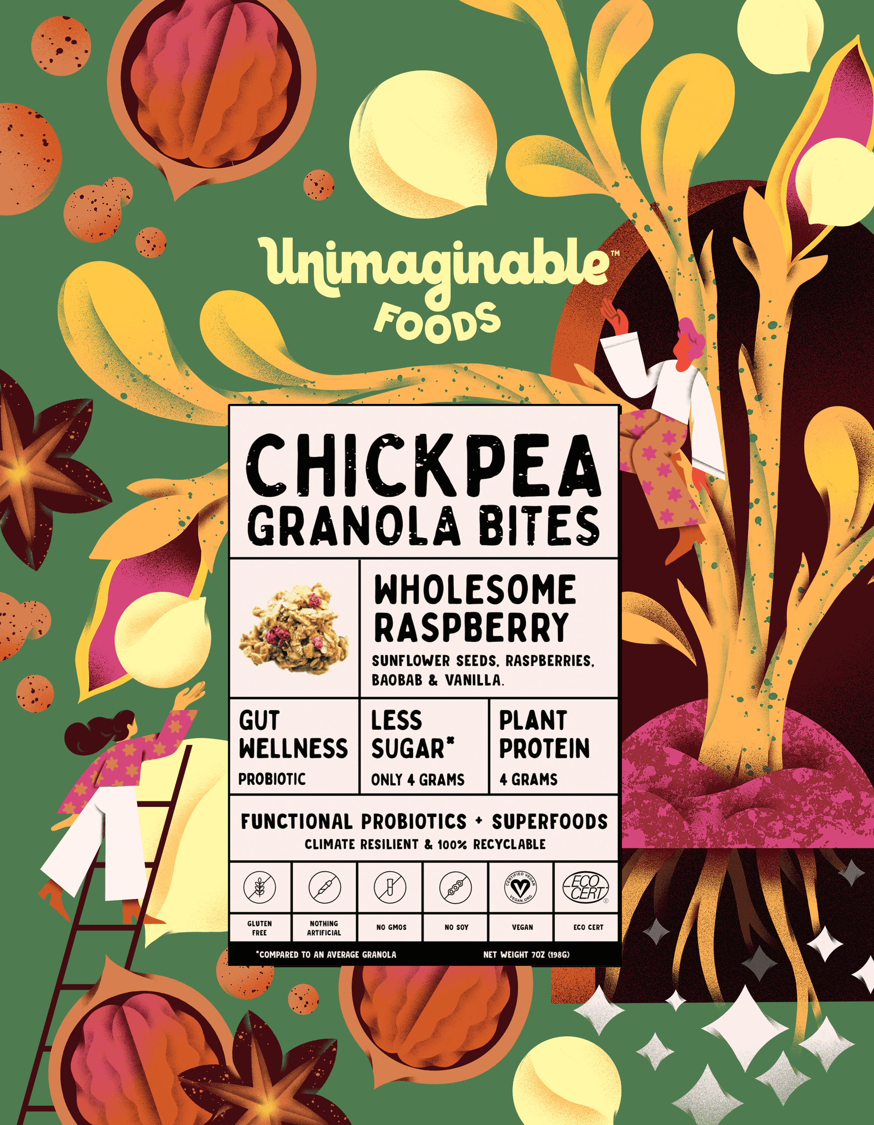
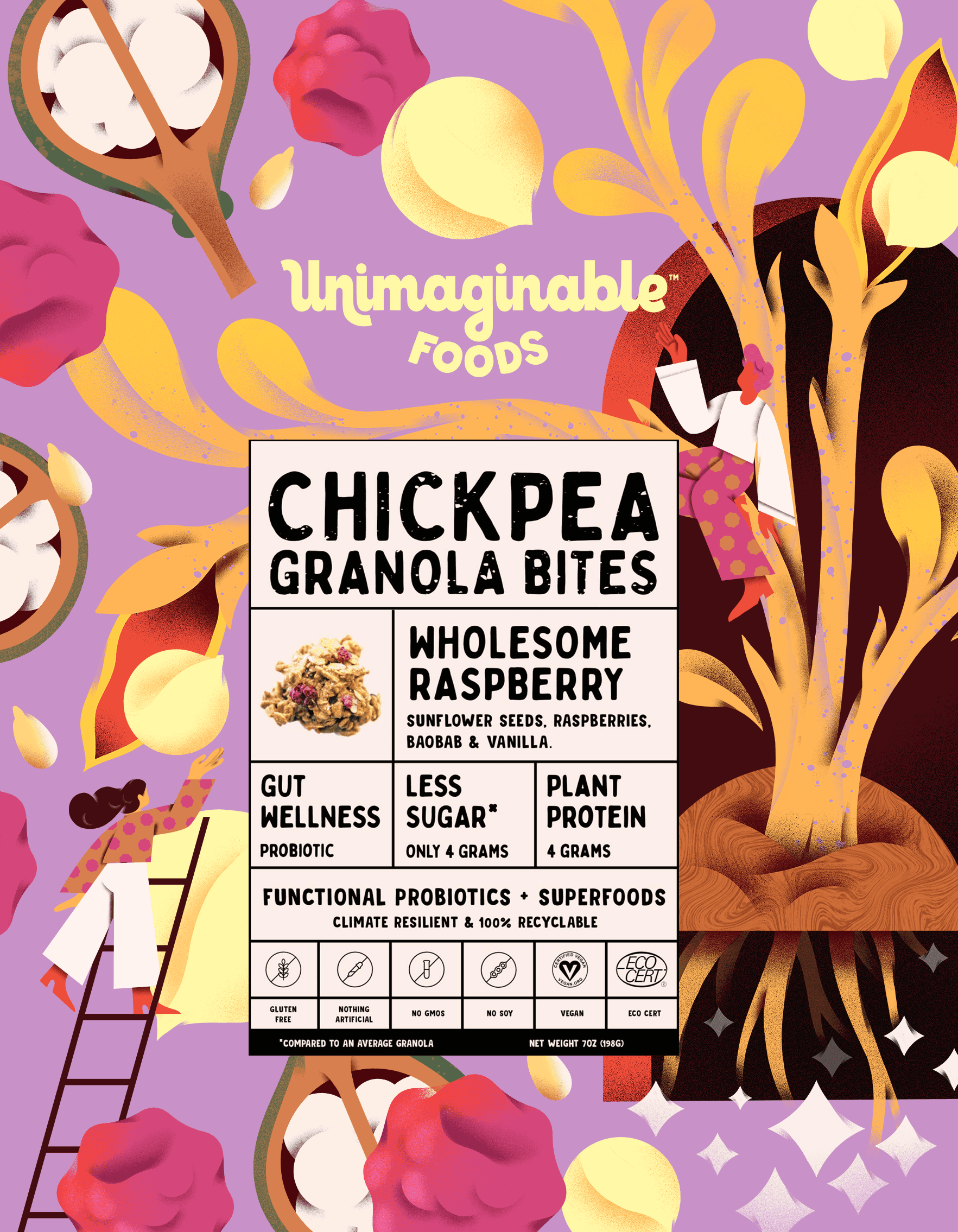
Core Unimaginable Foods product - Chickpea Granola comes in a variety of flavours. Packaging design is featuring bold illustrated ingredients and bold typography.
Core Unimaginable Foods product - Chickpea Granola comes in a variety of flavours. Packaging design is featuring bold illustrated ingredients and bold typography.
Core Unimaginable Foods product - Chickpea Granola comes in a variety of flavours. Packaging design is featuring bold illustrated ingredients and bold typography.


Another core product - botanical lattes utilizes more herbal and floral ingredients, but uses the same attractive style.
Another core product - botanical lattes utilizes more herbal and floral ingredients, but uses the same attractive style.
Another core product - botanical lattes utilizes more herbal and floral ingredients, but uses the same attractive style.


PRODUCT UPDATE
PRODUCT UPDATE
After several years of producing a variety of sustainable snacks and drinks, Unimaginable food decided to focus on one product - oatmilk lattes. Which required to update the packaging.
The design became more straight forward, utilizing a big illustrated product shot, while still keeping the warmth and whimpsy of the base identity.


